Photo via Inc.
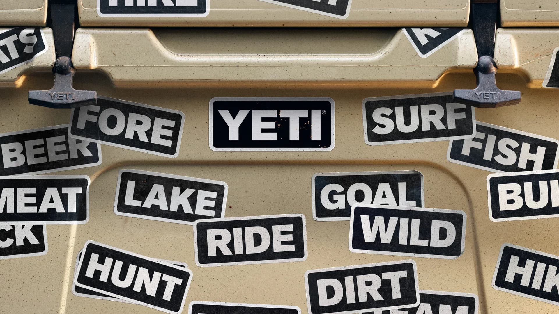
Yeti, the Austin-based outdoor brand known for premium coolers and drinkware, recently unveiled a redesigned logo that ditches its traditional wordmark in favor of a minimalist approach featuring various four-letter words. The strategy represents a significant bet on consumer brand loyalty and recognition—a move that Dallas-area retail and consumer goods executives should watch closely as a case study in modern branding.
According to Inc., the new logo is undeniably clever, leveraging wordplay and minimalist design principles that appeal to younger, digitally-savvy consumers. However, the approach also exposes the potential vulnerabilities of stripped-down branding. By removing the company name entirely, Yeti assumes that its iconic status is strong enough to stand alone—a luxury few brands can claim, even in the premium outdoor goods sector.
The rebrand raises important questions for North Texas business leaders in retail and consumer goods: How much equity can a company safely remove from its visual identity? While minimalism has dominated design trends, there's a fine line between elegant simplicity and oversimplification that may confuse new customers or dilute brand recall in crowded retail environments.
For Dallas companies considering similar minimalist pivots, Yeti's strategy serves as a valuable reminder that bold creative choices demand equally strong brand fundamentals. Success with such approaches typically requires exceptional market positioning, consistent consumer engagement, and a willingness to accept some risk in exchange for perceived innovation and cultural relevance.