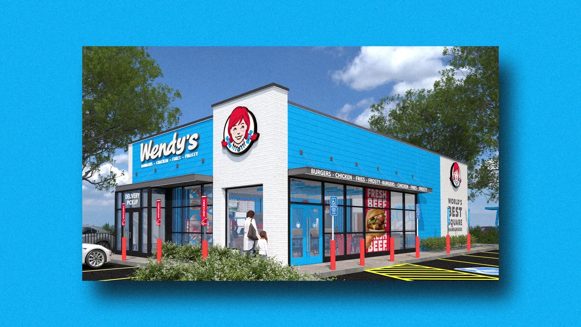
Photo via Inc.
Wendy's is experimenting with a departure from one of the most established conventions in food service branding: the dominance of red and warm colors in quick-service restaurant design. According to reporting from Inc., the burger chain is permitting franchisees in select international markets to adopt light blue restaurant facades as an alternative to the company's traditional red branding. This shift represents a calculated gamble on whether visual design can effectively communicate a restaurant's operational approach to customers.
The strategic reasoning behind the color change centers on digital ordering infrastructure. Light blue serves as a visual shorthand to signal that a location prioritizes digital channels—mobile ordering, kiosks, and app-based transactions—rather than traditional counter service. As Dallas-based quick-service restaurants and franchisees evaluate their own digital transformation strategies, Wendy's experiment offers insight into how branding decisions can reinforce operational positioning in an increasingly technology-driven industry.
Color psychology in restaurant branding has long favored warm hues like red and orange, which research suggests stimulate appetite and create a sense of urgency. Wendy's decision to test a cooler palette challenges this orthodoxy, betting that modern consumers—particularly those engaged with digital platforms—may respond positively to visual cues that align with their ordering method rather than appetite-stimulation alone.
For North Texas franchisees and restaurant operators, the Wendy's experiment underscores a broader evolution in retail food service: the need to communicate brand identity in ways that reflect contemporary consumer behavior and technology adoption. As the restaurant industry continues adapting to digital-first expectations, design choices that authentically represent a location's service model may prove as important as traditional appetite appeal.