Photo via Inc.
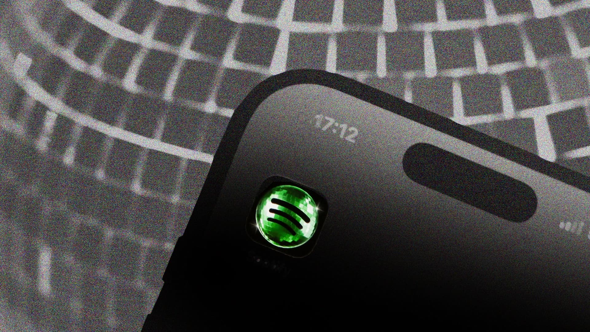
Streaming giant Spotify recently updated its iconic app icon, swapping its recognizable green circle for a disco ball design, and the change ignited considerable discussion across social media platforms. According to Inc., the move prompted users and brand observers to question whether such visual overhauls are worth the potential backlash they generate.
For Dallas-area tech companies and startups, Spotify's experience offers a valuable case study in brand evolution. The pushback reveals how emotionally invested users become in familiar visual identities, and how rapidly public sentiment can shift when established symbols change—a consideration that should inform any technology company's rebranding strategy.
The debate also highlights a broader tension in the tech industry: the desire to refresh brand perception and signal innovation versus the risk of alienating loyal users who associate the original design with the product itself. Companies must weigh metrics like brand recognition and customer attachment against modernization goals.
As Dallas continues to grow as a tech hub, local companies contemplating logo redesigns or visual rebrandings should study how audience response shapes brand perception. Spotify's disco ball moment demonstrates that major design decisions require not just aesthetic considerations, but careful planning around stakeholder communication and change management.


